[ラビットチャレンジ] 機械学習 レポート
はじめに
本稿は、E資格の受験資格の取得を目的としたラビットチャレンジの受講に伴うレポート記事である。
線型回帰モデル
概要
回帰モデルは教師ありモデルである。ある入力(離散あるいは連続値)から出力(連続値)を予測する問題を回帰問題という。
特に直線で予測する場合を線形回帰という。
具体的には教師データ$(\boldsymbol{x_i},y_i),\ i=1,\cdots,n,\ \boldsymbol{x_i}=(x_{i1},x_{i2},\cdots,x_{im})^T \in \mathbb{R}^m,\ y_i \in \mathbb{R}$に対して、下記のようにパラメータ$\boldsymbol{w}=(w_1,w_2,\cdots,w_m)^T \in \mathbb{R}^m$と$w_0 \in \mathbb{R}$を用いて、データ$\boldsymbol{x}$の線形結合となるモデル$\hat{y}$の作成を目的としている。
\begin{align}
\hat{y}
= \boldsymbol{w} \boldsymbol{x} + w_0
= \sum_{j=1}^{m} w_j x_j + w_0
\end{align}
$m=1$のとき単回帰といい、$m>1$のとき重回帰という。
パラメータ$\boldsymbol{w}=(w_1,w_2,\cdots,w_m)^T \in \mathbb{R}^m$と$w_0 \in \mathbb{R}$は未知で、以下の平均二乗誤差を最小とするパラメータを探索することにより推定する。これを最小二乗法という。
\begin{align}
{\rm MSE}
= \frac{1}{n} \sum_{i=1}^{n}(\hat{y_i}-y_i)^{2}
\end{align}
ここで、パラメータ$\boldsymbol{w}$を以下のようにまとめて書く。
\begin{align}
\boldsymbol{w}
= (w_0, w_1, \cdots, w_m)^T
\end{align}
また、$X$を以下のように定義する。
\begin{align}
X
= \begin{pmatrix}
1 & x_{11} & \cdots & x_{1m} \\
1 & x_{22} & \cdots & x_{2m} \\
\vdots & \vdots &\ddots & \vdots \\
1 & x_{n2} & \cdots & x_{nm}
\end{pmatrix}
\end{align}
平均二乗誤差を最小とするパラメータを推定する、つまり$\hat{\boldsymbol{w}} = \arg\min_{\boldsymbol{w}} {\rm MSE}$は以下の通り求められる。
\begin{align} \frac{\partial}{\partial\boldsymbol{w}} {\rm MSE} = 0 \end{align}
これを計算すると$\hat{\boldsymbol{w}}$は以下のようになる。
\begin{align} \hat{\boldsymbol{w}} = (X^TX)^{-1}X^T\boldsymbol{y} \end{align}
実装演習
必要なライブラリをインポートする。
      from sklearn.datasets import load_boston
from pandas import DataFrame
import numpy as np
データをインポートし、データの中身を確認する。
      boston = load_boston()

print(boston['DESCR'])
print(boston['feature_names'])
print(boston['data'])
print(boston['target'])
説明変数・目的変数からデータフレームを作成する。
      # 説明変数らをDataFrameへ変換
df = DataFrame(data=boston.data, columns = boston.feature_names)

# 目的変数をDataFrameへ追加
df['PRICE'] = np.array(boston.target)

# 最初の5行を表示
df.head(5)
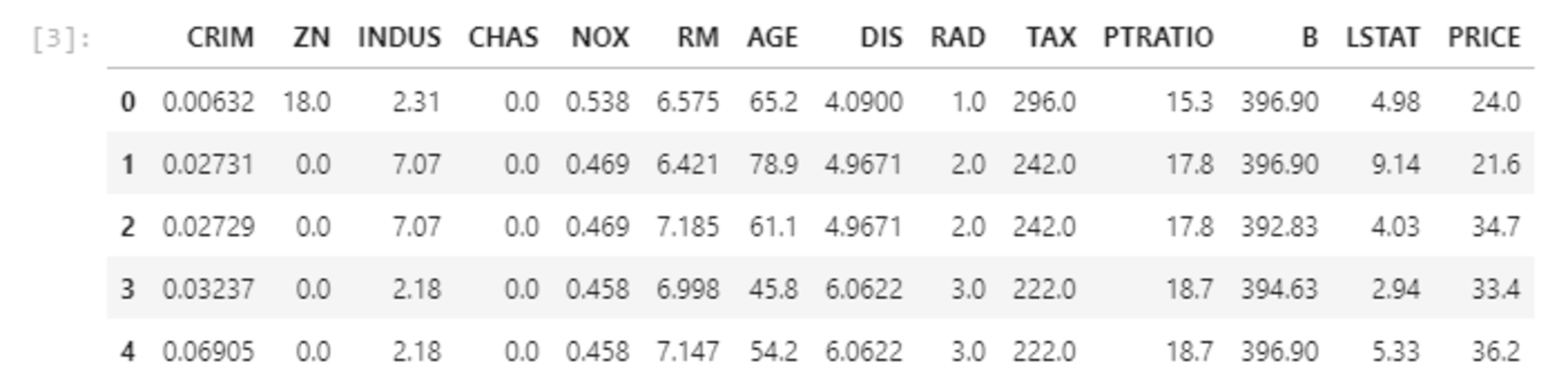 df.head(5)
 len
len
単回帰分析
単回帰で、部屋数(RM)から住宅価格(PRICE)を予測することを考える。
      # 説明変数
data = df.loc[:, ['RM']].values

# 目的変数
target = df.loc[:, 'PRICE'].values

## sklearnモジュールからLinearRegressionをインポート
from sklearn.linear_model import LinearRegression

# オブジェクト生成
model = LinearRegression()

# fit関数でパラメータ推定
model.fit(data, target)
部屋数を1から7としたときの予測値は以下の通り。
      #予測 -> 部屋数N個の場合
print("部屋:1 ->" , model.predict([[1]]))
print("部屋:2 ->" , model.predict([[2]]))
print("部屋:3 ->" , model.predict([[3]]))
print("部屋:4 ->" , model.predict([[4]]))
print("部屋:5 ->" , model.predict([[5]]))
print("部屋:6 ->" , model.predict([[6]]))
print("部屋:7 ->" , model.predict([[7]]))
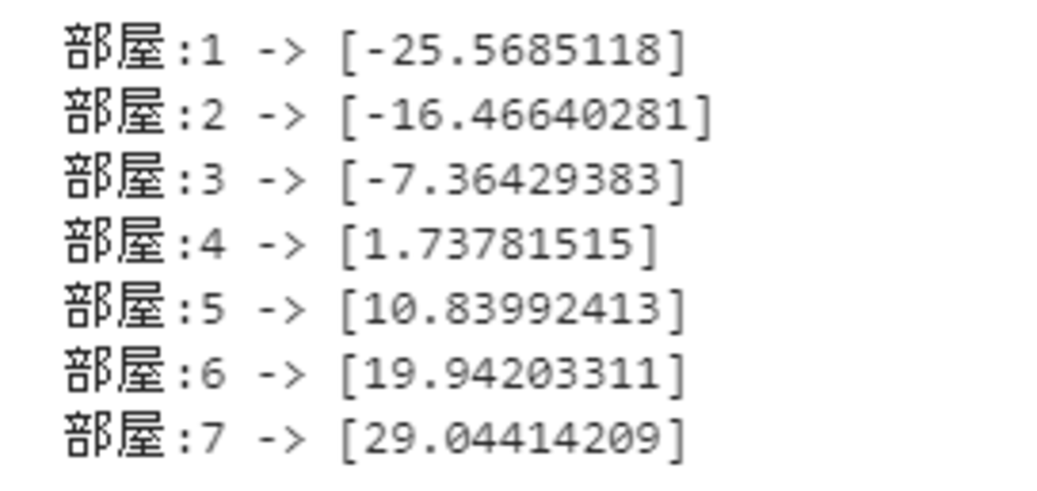
部屋数が4以上になると、正になるが、3以下の場合は負となっている。
この原因は、モデルの設計をミスしている(部屋数で家賃を表すのは適切ではなかった)、直線fittingがよくない、説明変数が足りていない、などの要因が考えられる。
重回帰分析
今度は犯罪率(CRIM)と部屋数(RM)から住宅価格(PRICE)を予測することを考える。
      # 説明変数
data2 = df.loc[:, ['CRIM', 'RM']].values
# 目的変数
target2 = df.loc[:, 'PRICE'].values

# オブジェクト生成
model2 = LinearRegression()

# fit関数でパラメータ推定
model2.fit(data2, target2)
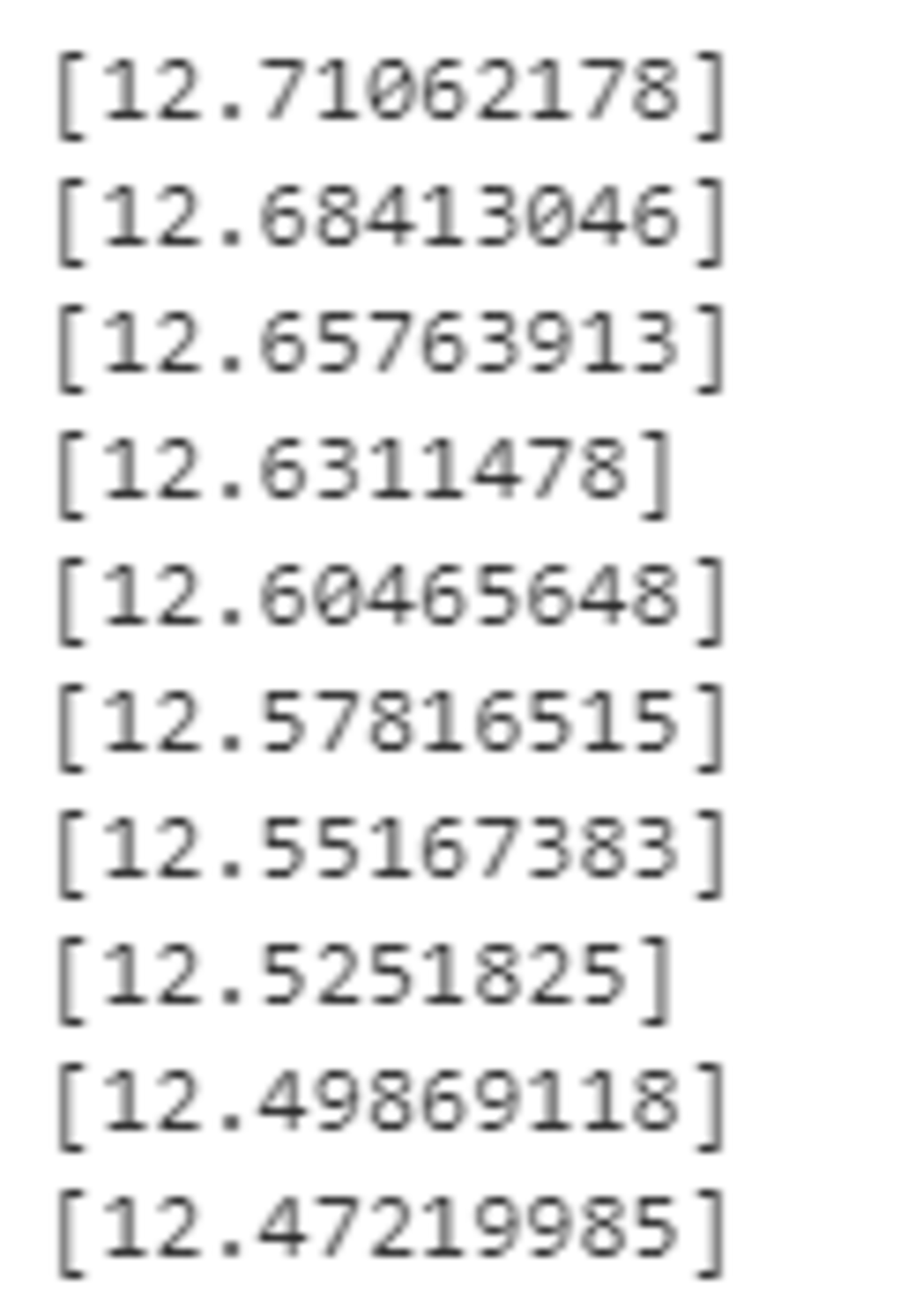
犯罪率を固定して、部屋数を増加させる。
      for rm in range(10):
  print(model2.predict([[0.2, rm+1]]))

最初の3つはマイナスになってしまっているが、部屋数が増えるごとに価格が上昇していることがわかる。
部屋数を固定して犯罪率を上昇させる。
      for c in [i/10 for i in range(10)]:
  print(model2.predict([[c, 5]]))
上昇する度に減少傾向にあるため、直観とは反する結果になっている。
非線形回帰モデル
概要
線形回帰が直線で予測していたのに対して、こちらは曲線により予測する。データ構造を線形で捉えられる場合は限られており、線形ではできなかった非線形な構造を捉えるために用いられる。
$\boldsymbol{w}$との内積を直接$\boldsymbol{x}$とは取らずに、基底関数と呼ばれる非線形な関数$\boldsymbol{\phi}(\boldsymbol{x})=(1,\phi_1(\boldsymbol{x}),\cdots,\phi_m(\boldsymbol{x}))^T$を取ることによって対応する。
\begin{align} \hat{y} = \sum_{j=1}^{m}w_j\phi_j(\boldsymbol{x})+w_0 \end{align}
ここで$\Phi(\boldsymbol{x})$を以下のように定義する。
\begin{align} \Phi(\boldsymbol{x})=\left( \begin{array}{c} \boldsymbol{\phi}(\boldsymbol{x}_1)^T\\ \boldsymbol{\phi}(\boldsymbol{x}_2)^T\\ \vdots\\ \boldsymbol{\phi}(\boldsymbol{x}_n)^T \end{array} \right) \end{align}
未知のパラメータは線形回帰のときと同様に最小二乗法により、以下によってパラメータの推定値$\hat{\boldsymbol{w}}$は求まる。
\begin{align} \hat{\boldsymbol{w}} = (\Phi(\boldsymbol{x})^T\Phi(\boldsymbol{x}))^{-1}\Phi(\boldsymbol{x})^T\boldsymbol{y} \end{align}
以下、基底関数の例を挙げる。
- 多項式
\begin{align} \phi_j(x) = x^j \end{align}
- ガウス型基底
\begin{align} \phi_j(x) = \exp{\frac{(x-\mu_j)^2}{2h_j}} \end{align}
- 2次元ガウス型基底関数
\begin{align} \phi_j(\boldsymbol{x}) = \exp{\frac{(\boldsymbol{x}-\mu_j)^T(\boldsymbol{x}-\mu_j)}{2h_j}} \end{align}
実装演習
必要なライブラリをインポートする。
      import numpy as np
import matplotlib.pyplot as plt
import seaborn as sns

%matplotlib inline
作図を行うライブラリであるseabornの設定を行う。
      #seaborn設定
sns.set()
#背景変更
sns.set_style("darkgrid", {'grid.linestyle': '--'})
#大きさ(スケール変更)
sns.set_context("paper")
データを生成し、作図を行う。
n=100
def true_func(x):
z = 1-48*x+218*x**2-315*x**3+145*x**4
return z
def linear_func(x):
z = x
return z
# 真の関数からノイズを伴うデータを生成
# 真の関数からデータ生成
data = np.random.rand(n).astype(np.float32)
data = np.sort(data)
target = true_func(data)
# ノイズを加える
noise = 0.5 * np.random.randn(n)
target = target + noise
# ノイズ付きデータを描画
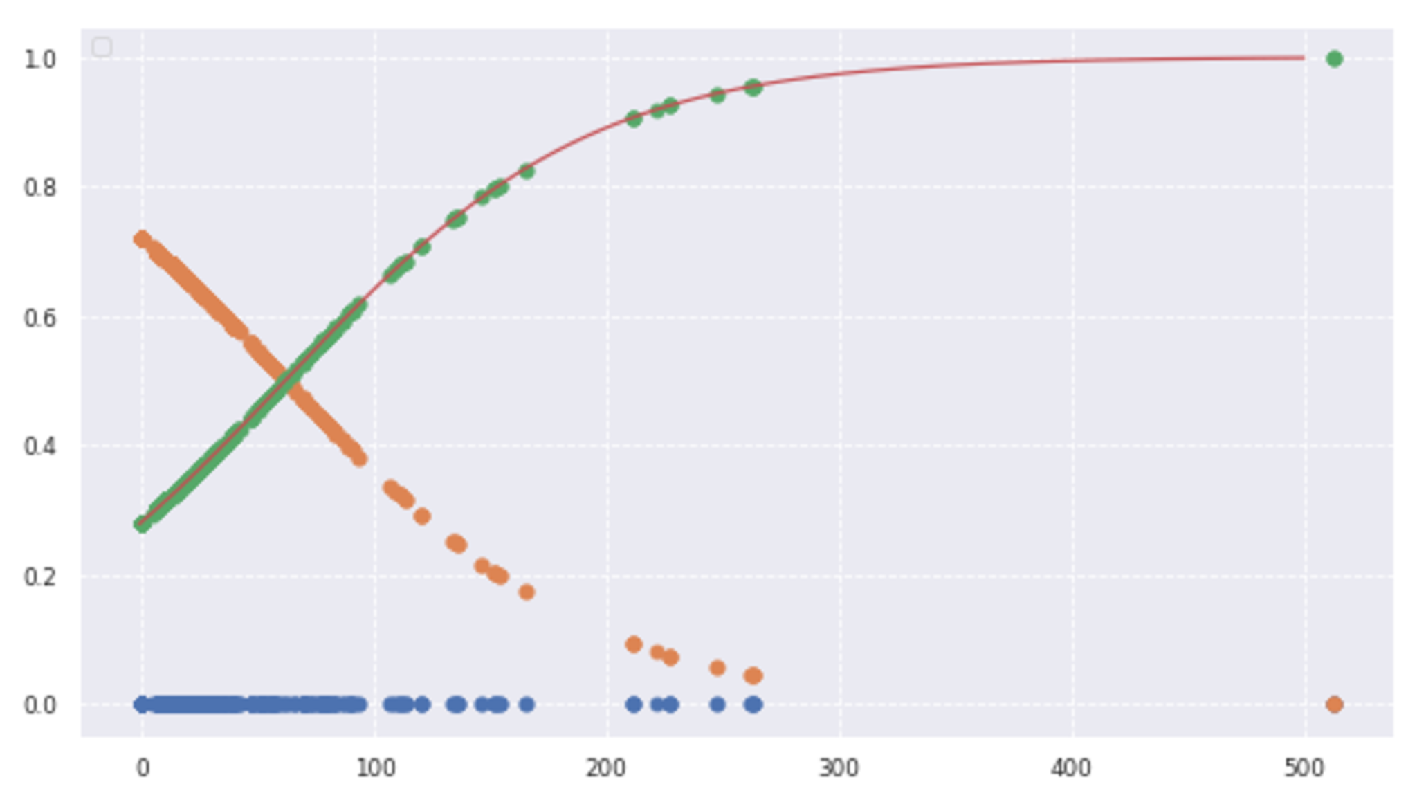
plt.scatter(data, target)
plt.title('NonLinear Regression')
plt.legend(loc=2)
以下のようなデータが生成された。
これは直線での表現は難しいことが直感的にわかる。
線形回帰の場合
      from sklearn.linear_model import LinearRegression

clf = LinearRegression()
data = data.reshape(-1,1)
target = target.reshape(-1,1)
clf.fit(data, target)

p_lin = clf.predict(data)

plt.scatter(data, target, label='data')
plt.plot(data, p_lin, color='darkorange', marker='', linestyle='-', linewidth=1, markersize=6, label='linear regression')
plt.legend()
print(clf.score(data, target))
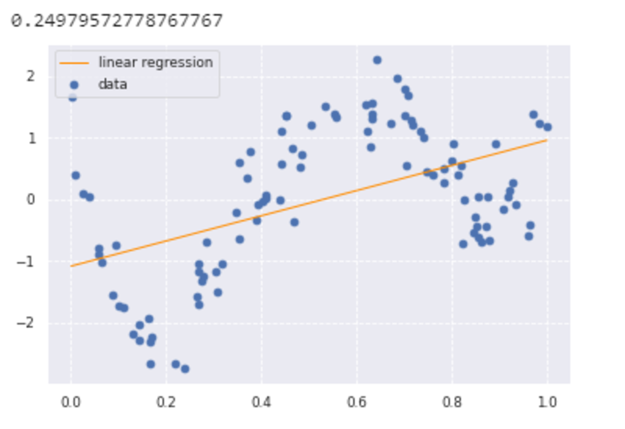
グラフとスコアより、直線ではうまくデータの特徴をつかめていないことがわかる。
非線形回帰の場合
      from sklearn.kernel_ridge import KernelRidge

clf = KernelRidge(alpha=0.0002, kernel='rbf')
clf.fit(data, target)

p_kridge = clf.predict(data)

plt.scatter(data, target, color='blue', label='data')

plt.plot(data, p_kridge, color='orange', linestyle='-', linewidth=3, markersize=6, label='kernel ridge')
plt.legend()

グラフの通り、線形回帰と比べてデータの特徴をうまくつかんでいることがわかる。
ロジスティック回帰モデル
概要
分類問題を解くための教師あり機械学習モデルである。ここで分類問題とはある入力(数値)から確率的にクラスに分類する問題である。
2クラス分類のうち、$\{0, 1\}$の分類を確率的分類、$\{-1, 1\}$の分類を決定的分類という。決定的分類の例は後述のサポートベクターマシンである。
ロジスティック回帰でも、モデル$\hat{y}$を$\boldsymbol{x}$の線形関数として求めるが、ここでは$(0,1)$に値を取る連続関数である以下のシグモイド関数を用いる。
\begin{align}
\sigma(x)=\frac{1}{1+\exp(-x)}
\end{align}
このシグモイド関数を用いて、ロジスティック回帰モデルは以下の形式を取る。
\begin{align}
\hat{y} = \sigma(\sum_{j=1}^{m}w_jx_j+w_0)
\end{align}
シグモイド関数の出力が確率に対応し、閾値が0.5以上であれば$\boldsymbol{x}$のクラスは1、そうでなければ0と予測することができる。
ロジスティック回帰では、未知のパラメータ$\boldsymbol{w}$を推定する際、最尤推定法により、以下の尤度関数が最大となるパラメータを探索することで求める。
\begin{align} \boldsymbol{L}(\boldsymbol{w})=\prod_{i=1}^n \hat{y}_{i}^{y_i}(1-\hat{y}_{i})^{(1-y_i)} \end{align}
実際の計算では、この式の対数である対数尤度関数を最大化するアプローチを用いる。
ここでは最小二乗法と合わせるために、さらにマイナスを掛けることで以下の式を最小化する問題を考える。
\begin{align}
E(\boldsymbol{w})=-\log{\boldsymbol{L}(\boldsymbol{w})}=-\sum_{i=1}^n (y_{i}\log{\hat{y}_{i}}+(1-y_{i})\log{(1-\hat{y}_{i})})
\end{align}
この対数尤度関数のパラメータによる微分が0になる値を最小二乗法のときのように解析的に求めるのは難しいため、勾配降下法などの最適化アルゴリズムにより求める。
実装演習
必要なライブラリをインポートする。
      #from モジュール名 import クラス名(もしくは関数名や変数名)
import pandas as pd
from pandas import DataFrame
import numpy as np
import matplotlib.pyplot as plt
import seaborn as sns

#matplotlibをinlineで表示するためのおまじない (plt.show()しなくていい)
%matplotlib inline
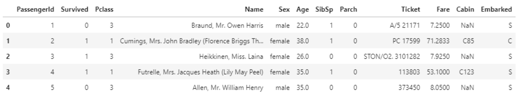
titanicデータを読み込み、中身を確認する。
      # titanic data csvファイルの読み込み
titanic_df = pd.read_csv('titanic_train.csv')
# ファイルの先頭部を表示し、データセットを確認する
titanic_df.head(5)
欠損値やテキストデータがある状態のとき、そのまま扱うことができない。
そのためデータの前処理を行う。
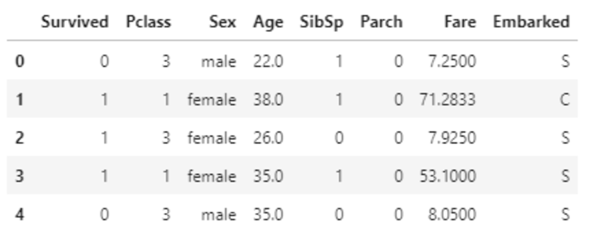
まずは不要なデータを削除する。
      #予測に不要と考えるカラムをドロップ
titanic_df.drop(['PassengerId', 'Name', 'Ticket', 'Cabin'], axis=1, inplace=True)

#一部カラムをドロップしたデータを表示
titanic_df.head()
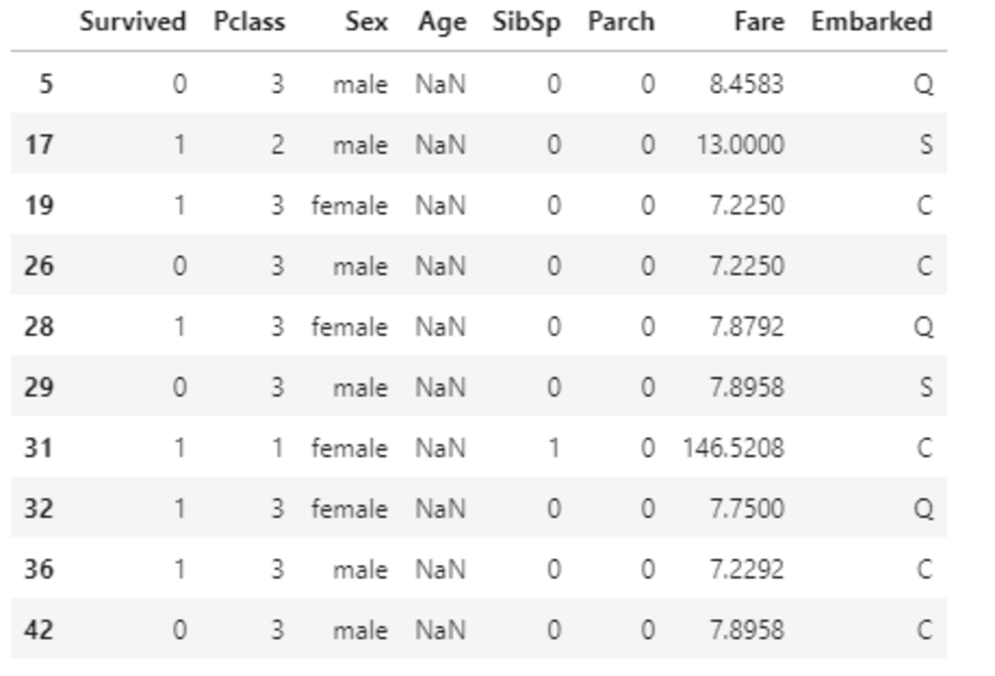
次に欠損値補完を行う。
欠損値を含む行を表示する。
      #nullを含んでいる行を表示
titanic_df[titanic_df.isnull().any(1)].head(10)
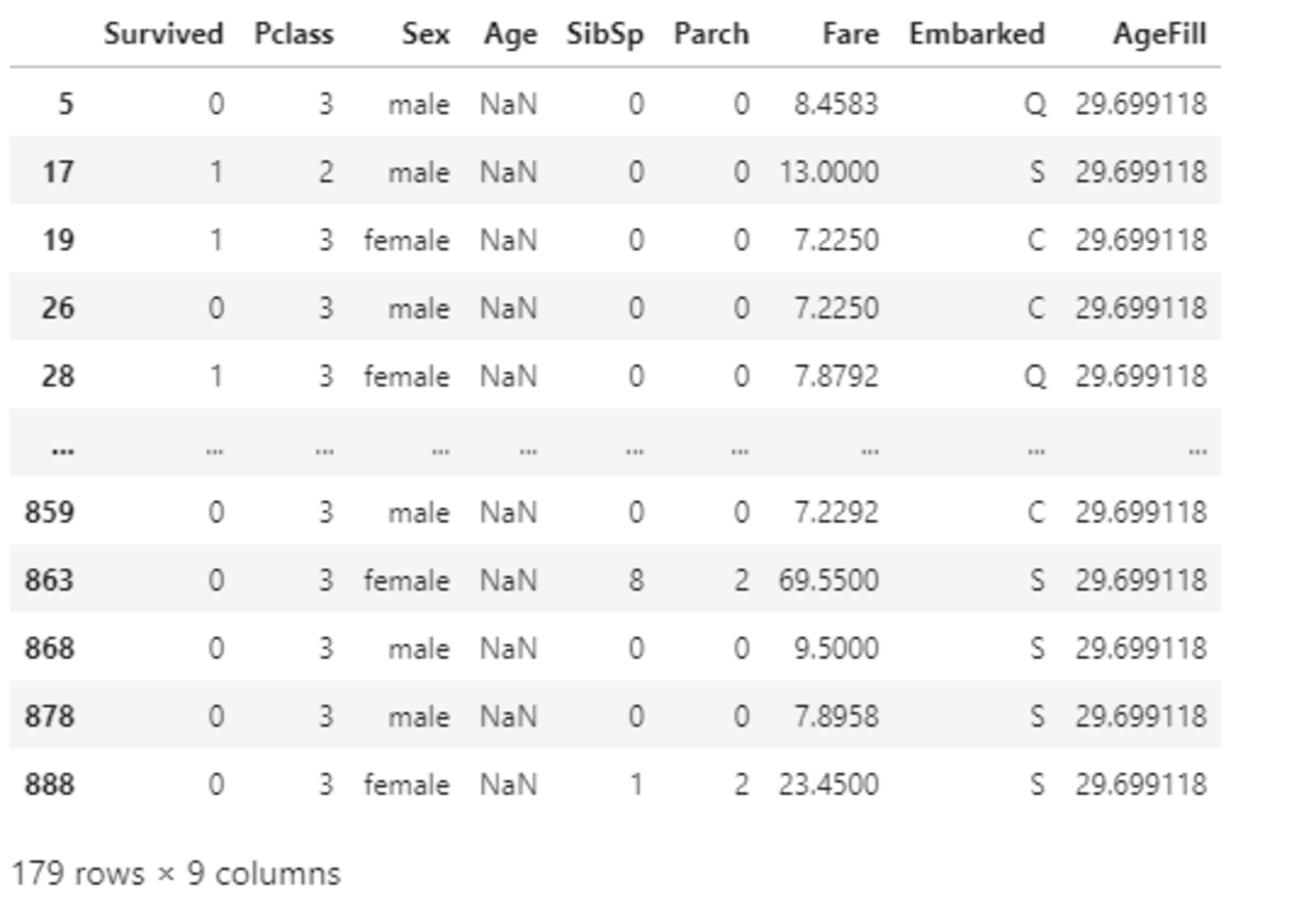
Ageの欠損値を平均値で補完する。
      #Ageカラムのnullを平均値で補完

titanic_df['AgeFill'] = titanic_df['Age'].fillna(titanic_df['Age'].mean())

#再度nullを含んでいる行を表示 (Ageのnullは補完されている)
titanic_df[titanic_df.isnull().any(1)]

#titanic_df.dtypes
次にこのデータを用いて、ロジスティック回帰により、運賃から生死を判別することを考える。
      #運賃だけのリストを作成
data1 = titanic_df.loc[:, ["Fare"]].values
#生死フラグのみのリストを作成
label1 =  titanic_df.loc[:,["Survived"]].values

from sklearn.linear_model import LogisticRegression

model=LogisticRegression()
model.fit(data1, label1)
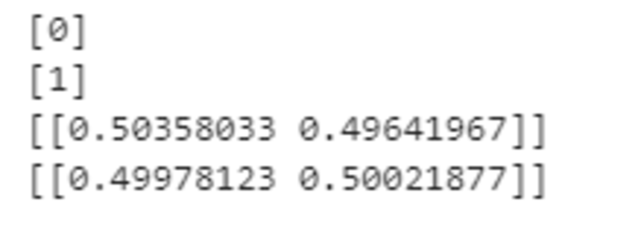
predictを使うと、どのクラスに分類されたか出力され、predict_probaを使うと確率で出力される。
0.5を境に分類結果が変わっていることが以下の結果よりわかる。
      print(model.predict([[61]]))
print(model.predict([[62]]))
print(model.predict_proba([[61]]))
print(model.predict_proba([[62]]))
      w_0 = model.intercept_[0]
w_1 = model.coef_[0,0]

# def normal_sigmoid(x):
#     return 1 / (1+np.exp(-x))

def sigmoid(x):
    return 1 / (1+np.exp(-(w_1*x+w_0)))

x_range = np.linspace(-1, 500, 3000)

plt.figure(figsize=(9,5))
#plt.xkcd()
plt.legend(loc=2)


# plt.ylim(-0.1, 1.1)
# plt.xlim(-10, 10)

# plt.plot([-10,10],[0,0], "k", lw=1)
# plt.plot([0,0],[-1,1.5], "k", lw=1)
plt.plot(data1,np.zeros(len(data1)), 'o')
plt.plot(data1, model.predict_proba(data1), 'o')
plt.plot(x_range, sigmoid(x_range), '-')
#plt.plot(x_range, normal_sigmoid(x_range), '-')
グラフより、運賃が高くなるほど生存率が高くなっていることがわかる。
次に2変数で生死を判別することを考える。
性別によって0か1に変換した新しい変数Genderを作成し、乗客の階級を表すPclassと組み合わせた変数Pclass_Genderを作成する。さらに不要な変数を削除する。
      titanic_df['Gender'] = titanic_df['Sex'].map({'female': 0, 'male': 1}).astype(int)
titanic_df['Pclass_Gender'] = titanic_df['Pclass'] + titanic_df['Gender']
titanic_df = titanic_df.drop(['Pclass', 'Sex', 'Gender','Age'], axis=1)
titanic_df.head()

      np.random.seed = 0

xmin, xmax = -5, 85
ymin, ymax = 0.5, 4.5

index_survived = titanic_df[titanic_df["Survived"]==0].index
index_notsurvived = titanic_df[titanic_df["Survived"]==1].index

from matplotlib.colors import ListedColormap
fig, ax = plt.subplots()
cm = plt.cm.RdBu
cm_bright = ListedColormap(['#FF0000', '#0000FF'])
sc = ax.scatter(titanic_df.loc[index_survived, 'AgeFill'],
                titanic_df.loc[index_survived, 'Pclass_Gender']+(np.random.rand(len(index_survived))-0.5)*0.1,
                color='r', label='Not Survived', alpha=0.3)
sc = ax.scatter(titanic_df.loc[index_notsurvived, 'AgeFill'],
                titanic_df.loc[index_notsurvived, 'Pclass_Gender']+(np.random.rand(len(index_notsurvived))-0.5)*0.1,
                color='b', label='Survived', alpha=0.3)
ax.set_xlabel('AgeFill')
ax.set_ylabel('Pclass_Gender')
ax.set_xlim(xmin, xmax)
ax.set_ylim(ymin, ymax)
ax.legend(bbox_to_anchor=(1.4, 1.03))

上図より、Pclass_Genderが小さいほど生存する傾向にあることがわかる。つまり、上流階級であるほど、そして男性より女性のほうが生存傾向にある。また年齢が若いほど生存傾向にある。
AgeFillとPclass_Genderの2変数を説明変数としてでモデルを構築する。
      #年齢とPclass_Genderのリストを作成
data2 = titanic_df.loc[:, ["AgeFill", "Pclass_Gender"]].values
#生死フラグのみのリストを作成
label2 =  titanic_df.loc[:,["Survived"]].values

model2 = LogisticRegression()
model2.fit(data2, label2)

print(model2.predict([[10,1]]))
print(model2.predict_proba([[10,1]]))
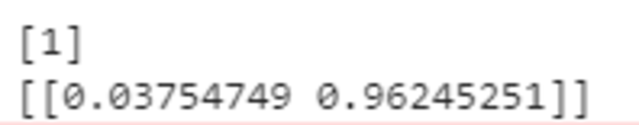
階級の高い10歳の女性は96%の確率で生存すると予測される。
h = 0.02
xmin, xmax = -5, 85
ymin, ymax = 0.5, 4.5
xx, yy = np.meshgrid(np.arange(xmin, xmax, h), np.arange(ymin, ymax, h))
Z = model2.predict_proba(np.c_[xx.ravel(), yy.ravel()])[:, 1]
Z = Z.reshape(xx.shape)
fig, ax = plt.subplots()
levels = np.linspace(0, 1.0)
cm = plt.cm.RdBu
cm_bright = ListedColormap(['#FF0000', '#0000FF'])
#contour = ax.contourf(xx, yy, Z, cmap=cm, levels=levels, alpha=0.5)
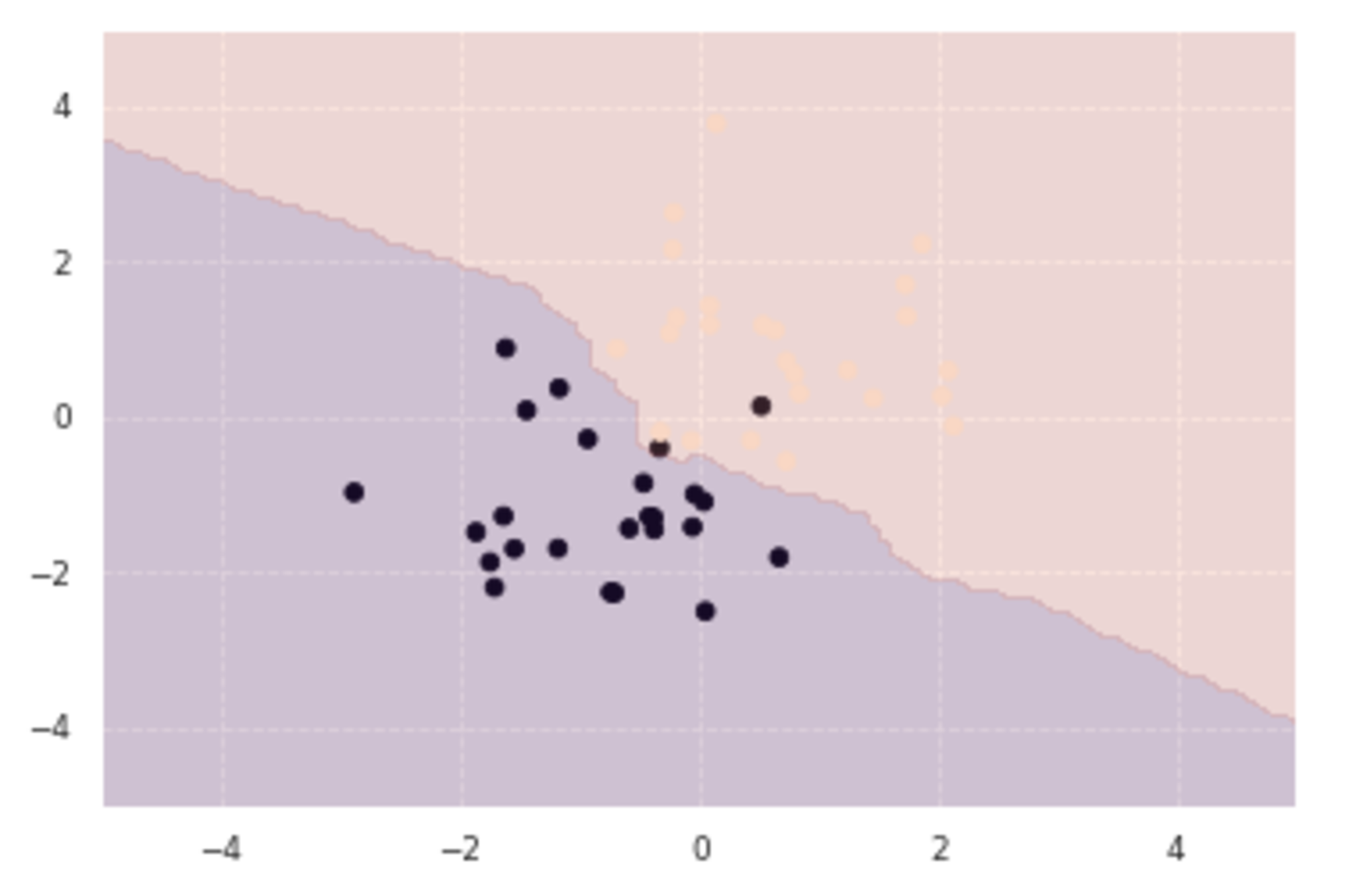
sc = ax.scatter(titanic_df.loc[index_survived, 'AgeFill'],
titanic_df.loc[index_survived, 'Pclass_Gender']+(np.random.rand(len(index_survived))-0.5)*0.1,
color='r', label='Not Survived', alpha=0.3)
sc = ax.scatter(titanic_df.loc[index_notsurvived, 'AgeFill'],
titanic_df.loc[index_notsurvived, 'Pclass_Gender']+(np.random.rand(len(index_notsurvived))-0.5)*0.1,
color='b', label='Survived', alpha=0.3)
ax.set_xlabel('AgeFill')
ax.set_ylabel('Pclass_Gender')
ax.set_xlim(xmin, xmax)
ax.set_ylim(ymin, ymax)
#fig.colorbar(contour)
x1 = xmin
x2 = xmax
y1 = -1*(model2.intercept_[0]+model2.coef_[0][0]*xmin)/model2.coef_[0][1]
y2 = -1*(model2.intercept_[0]+model2.coef_[0][0]*xmax)/model2.coef_[0][1]
ax.plot([x1, x2] ,[y1, y2], 'k--')
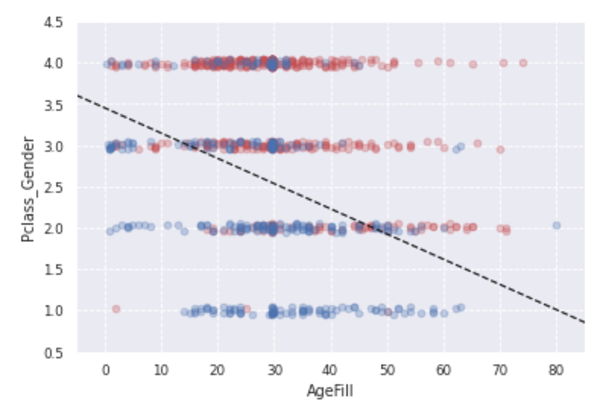
構築したモデルを使用して生死の境界を引くと上図のようになる。
次にモデルの評価を行う。
データを訓練データとテストデータに分割する。
      from sklearn.model_selection import train_test_split
traindata1, testdata1, trainlabel1, testlabel1 = train_test_split(data1, label1, test_size=0.2)
traindata2, testdata2, trainlabel2, testlabel2 = train_test_split(data2, label2, test_size=0.2)
モデルを構築し、テストデータを予測する。
      eval_model1=LogisticRegression()
eval_model2=LogisticRegression()
predictor_eval1=eval_model1.fit(traindata1, trainlabel1).predict(testdata1)
predictor_eval2=eval_model2.fit(traindata2, trainlabel2).predict(testdata2)

print(eval_model1.score(traindata1, trainlabel1))
print(eval_model1.score(testdata1,testlabel1))
print(eval_model2.score(traindata2, trainlabel2))
print(eval_model2.score(testdata2,testlabel2))
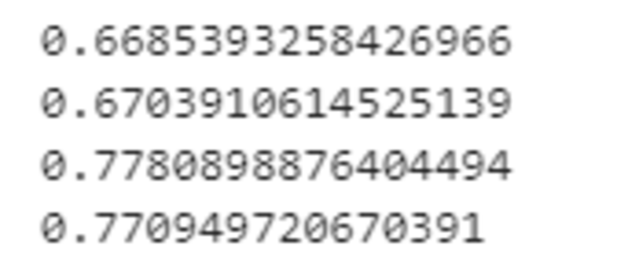
上記の結果より、2変数で構築したモデルのほうが正解率がよいことがわかる。
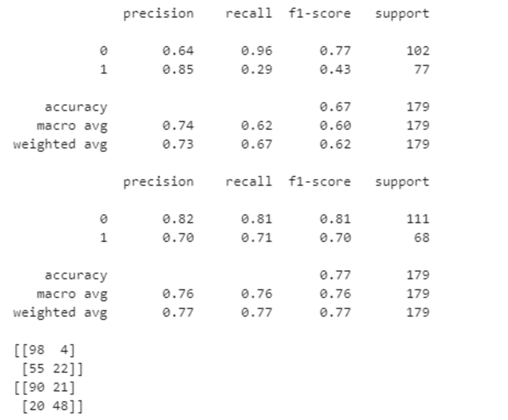
他の精度評価として以下を実行することで適合率、再現率、F値、混合行列を求めることができる。
F値の観点からも2変数のモデルのほうが精度が高いことがわかる。
      from sklearn import metrics
from sklearn.metrics import confusion_matrix
print(metrics.classification_report(testlabel1, predictor_eval1))
print(metrics.classification_report(testlabel2, predictor_eval2))
print(confusion_matrix(testlabel1, predictor_eval1))
print(confusion_matrix(testlabel2, predictor_eval2))
主成分分析
概要
主成分分析は教師なし学習のひとつで、次元圧縮の手法である。
与えられたデータをより低次元の空間へ射影し、射影後の点の散らばりがなるべく大きくなるようにすることで情報の損失を小さくする。2次元もしくは3次元へ圧縮することで多次元データの可視化がよりしやすくなる。
ここで、$n$個の$m$次元データ$\boldsymbol{x}_{1}$, $\cdots, \boldsymbol{x}_n \in\mathbb{R}^{m}$を考え、```$k$次元に圧縮することを考える。またこのデータの平均$\bar{\boldsymbol{x}}$を以下のように定義する。
\begin{align}
\bar{\boldsymbol{x}}=\frac{1}{n}\sum_{i=1}^{n}\boldsymbol{x}_i
\end{align}
またすべてのデータから$\bar{\boldsymbol{x}}$を引いたデータ行列$\bar{X}$を以下のように定義する。
\begin{align}
\bar{X}=(\boldsymbol{x}{1}-\bar{\boldsymbol{x}},\cdots,\boldsymbol{x}{n}-\bar{\boldsymbol{x}})^T \in \mathbb{R}^{n×m}
\end{align}
このとき、共分散行列$\Sigma$は以下のように表される。
\begin{align}
\Sigma=\frac{1}{n}\sum_{i=1}^{n}(\boldsymbol{x}{i}-\bar{\boldsymbol{x}})(\boldsymbol{x}{i}-\bar{\boldsymbol{x}})^T=\frac{1}{n}\bar{X}^T\bar{X}
\end{align}
次元圧縮後の分散を最大化するにあたり、以下の手順により、射影行列$\boldsymbol{W}$を求める。
- $\Sigma$の固有値・固有ベクトルを求める。
- 固有値を大きい順に並び替え、最も大きい$k$個の固有値に対応する$k$個の固有ベクトルを選択する。
- この固有ベクトルから射影行列$\boldsymbol{W} \in \mathbb{R}^{m×k}$を作成する。
この射影行列$\boldsymbol{W}$を用いることにより、$m$次元のデータを新しい$k$次元のデータへ変換することができる。
実装演習
必要なライブラリをインポートする。
      import pandas as pd
from sklearn.model_selection import train_test_split
from sklearn.preprocessing import StandardScaler
from sklearn.linear_model import LogisticRegressionCV
from sklearn.metrics import confusion_matrix
from sklearn.decomposition import PCA
import matplotlib.pyplot as plt
%matplotlib inline
データを読み込み、データ件数、カラム数を確認する。
      cancer_df = pd.read_csv('cancer.csv')

print('cancer df shape: {}'.format(cancer_df.shape))
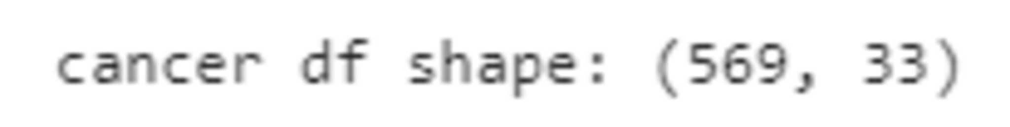
データは569件あり、次元は33である。
データを確認すると、欠損の列があるため、削除する。
      cancer_df.drop('Unnamed: 32', axis=1, inplace=True)

print('cancer df shape: {}'.format(cancer_df.shape))
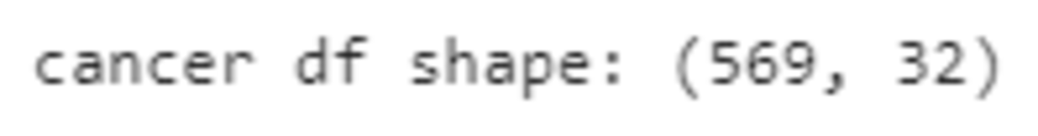
32次元となった。
本データは乳がん検査データであるが、そのままのデータで診断結果をきちんと判別できるかどうか確認した上で、主成分分析で情報量を削減しても判別できることを確認する。
目的変数をdiagnosisとし、良性(B)だったら1、悪性(M)だったら0とする。
また、radius_mean以降のデータを説明変数とする。
このデータを用いてロジスティック回帰により分類精度を確認する。
      # 目的変数の抽出
y = cancer_df.diagnosis.apply(lambda d: 1 if d == 'M' else 0)

# 説明変数の抽出
X = cancer_df.loc[:, 'radius_mean':]

# 学習用とテスト用でデータを分離
X_train, X_test, y_train, y_test = train_test_split(X, y, random_state=0)

# 標準化
scaler = StandardScaler()
X_train_scaled = scaler.fit_transform(X_train)
X_test_scaled = scaler.transform(X_test)

# ロジスティック回帰で学習
logistic = LogisticRegressionCV(cv=10, random_state=0)
logistic.fit(X_train_scaled, y_train)

# 検証
print('Train score: {:.3f}'.format(logistic.score(X_train_scaled, y_train)))
print('Test score: {:.3f}'.format(logistic.score(X_test_scaled, y_test)))
print('Confustion matrix:\n{}'.format(confusion_matrix(y_true=y_test, y_pred=logistic.predict(X_test_scaled))))
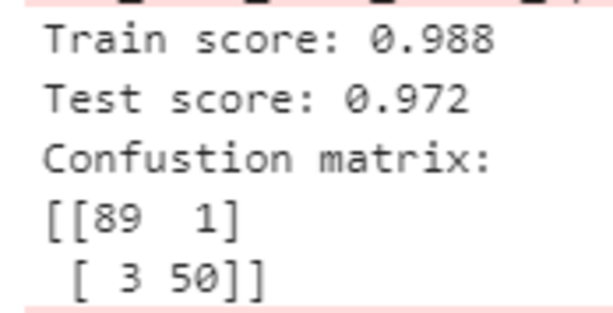
この結果から、かなり高い精度で分類できることがわかる。
ここから主成分分析を行い、次元削減してもうまく判別できるか確認する。
30次元まで削減してみる。
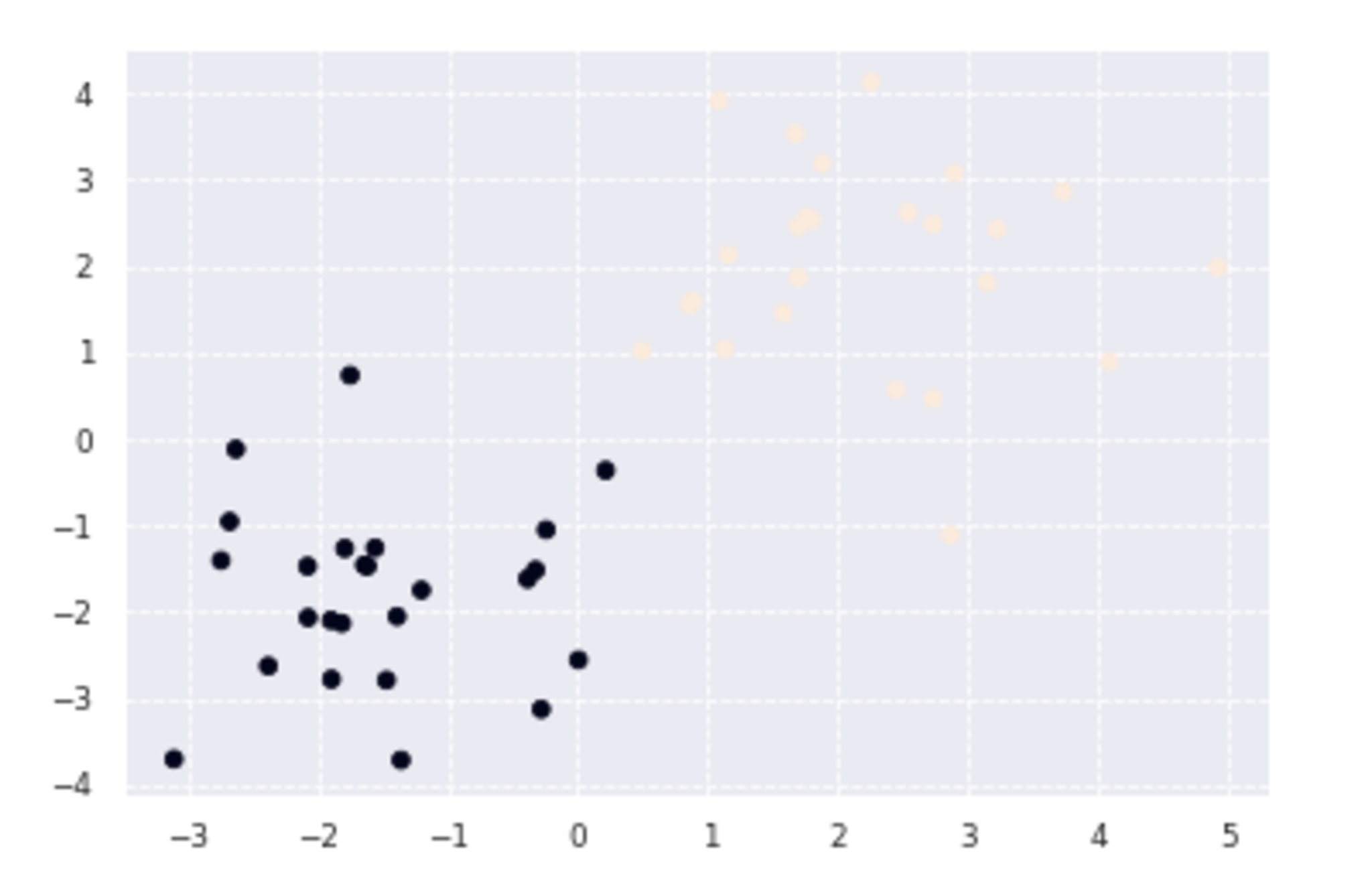
      pca = PCA(n_components=30)
pca.fit(X_train_scaled)
plt.bar([n for n in range(1, len(pca.explained_variance_ratio_)+1)], pca.explained_variance_ratio_)
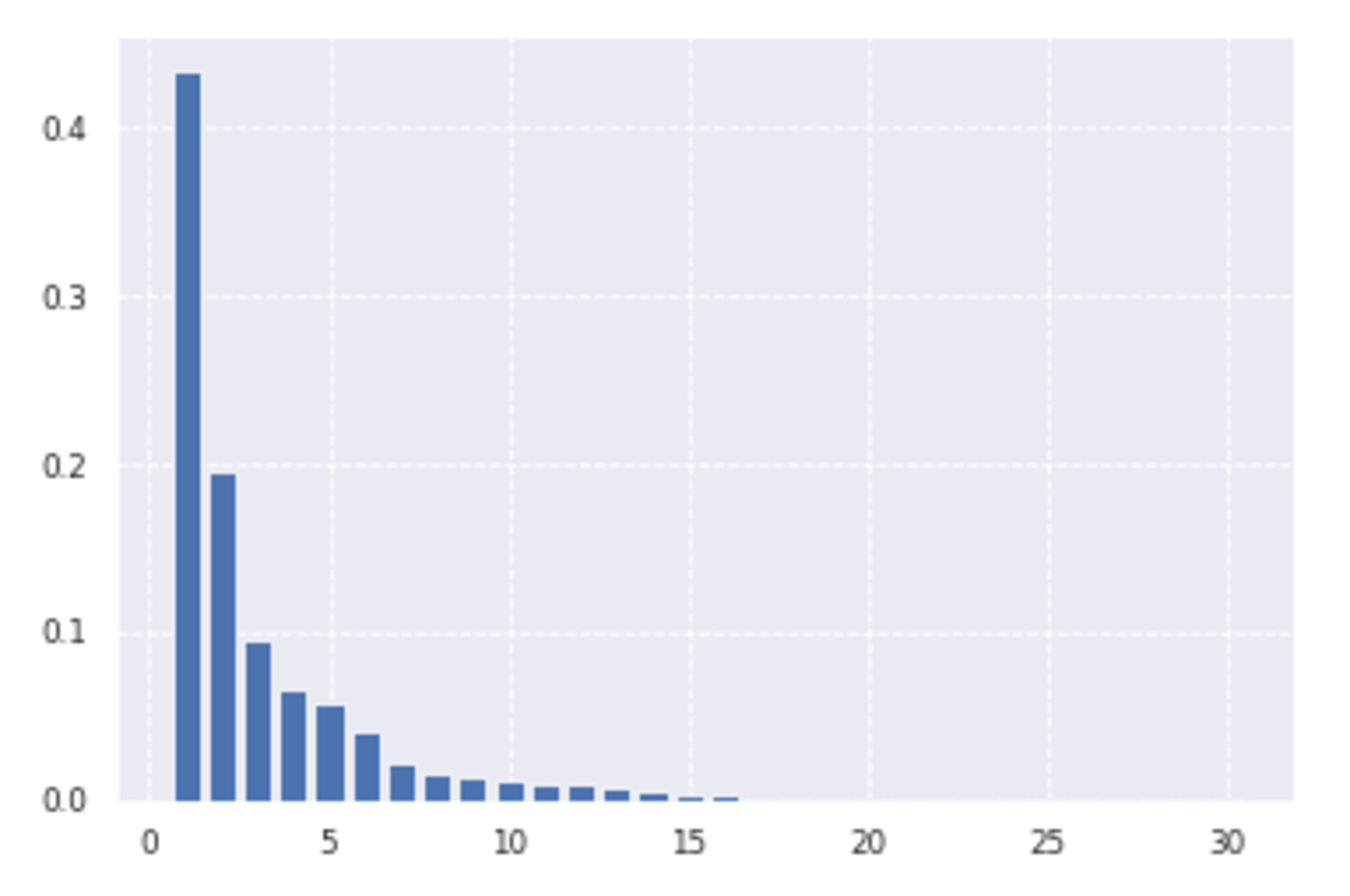
上のグラフは各主成分の説明力を表したものであるが、第1主成分の説明力は約43%、第2主成分の説明力は約19%である。ゆえに第1主成分と第2主成分を用いると、データの約62%説明できることを意味する。
データの可視化のため、2次元まで削減してみる。
      # PCA
# 次元数2まで圧縮
pca = PCA(n_components=2)
X_train_pca = pca.fit_transform(X_train_scaled)
print('X_train_pca shape: {}'.format(X_train_pca.shape))
# X_train_pca shape: (426, 2)

# 寄与率
print('explained variance ratio: {}'.format(pca.explained_variance_ratio_))
# explained variance ratio: [ 0.43315126  0.19586506]

# 散布図にプロット
temp = pd.DataFrame(X_train_pca)
temp['Outcome'] = y_train.values
b = temp[temp['Outcome'] == 0]
m = temp[temp['Outcome'] == 1]
plt.scatter(x=b[0], y=b[1], marker='o') # 良性は○でマーク
plt.scatter(x=m[0], y=m[1], marker='^') # 悪性は△でマーク
plt.xlabel('PC 1') # 第1主成分をx軸
plt.ylabel('PC 2') # 第2主成分をy軸
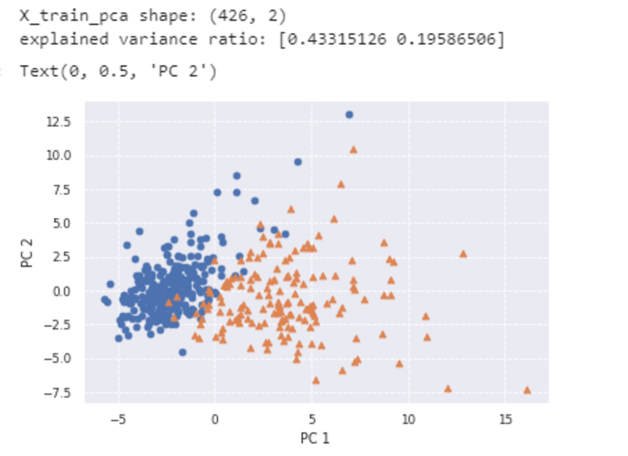
2次元でもそれなりに判別することができ、視覚的にも非常に識別しやすい形になったと言えるであろう。
k近傍法
概要
k近傍法は教師あり学習のひとつで、分類問題を解くための手法である。
新しいデータ$\boldsymbol{x}$が入ってきたときに、その$\boldsymbol{x}$から最も近い距離にある$k$個のデータを見つけて、$\boldsymbol{x}$をその中で最も多く所属するクラスに分類する。$k$が変わると、所属するデータの数が変わってくるため、分類結果も変わることに注意する。
実装演習
必要なライブラリをインポートする。
      %matplotlib inline
import numpy as np
import matplotlib.pyplot as plt
from scipy import stats
訓練データを生成する。
      def gen_data():
    x0 = np.random.normal(size=50).reshape(-1, 2) - 1
    x1 = np.random.normal(size=50).reshape(-1, 2) + 1.
    x_train = np.concatenate([x0, x1])
    y_train = np.concatenate([np.zeros(25), np.ones(25)]).astype(np.int)
    return x_train, y_train

X_train, ys_train = gen_data()
plt.scatter(X_train[:, 0], X_train[:, 1], c=ys_train)
k近傍法は訓練データから獲得するパラメータはないため学習ステップはない。
予測
def distance(x1, x2):
return np.sum((x1 - x2)**2, axis=1)
def knc_predict(n_neighbors, x_train, y_train, X_test):
y_pred = np.empty(len(X_test), dtype=y_train.dtype)
for i, x in enumerate(X_test):
distances = distance(x, X_train)
nearest_index = distances.argsort()[:n_neighbors]
mode, _ = stats.mode(y_train[nearest_index])
y_pred[i] = mode
return y_pred
def plt_resut(x_train, y_train, y_pred):
xx0, xx1 = np.meshgrid(np.linspace(-5, 5, 100), np.linspace(-5, 5, 100))
xx = np.array([xx0, xx1]).reshape(2, -1).T
plt.scatter(x_train[:, 0], x_train[:, 1], c=y_train)
plt.contourf(xx0, xx1, y_pred.reshape(100, 100).astype(dtype=np.float), alpha=0.2, levels=np.linspace(0, 1, 3))
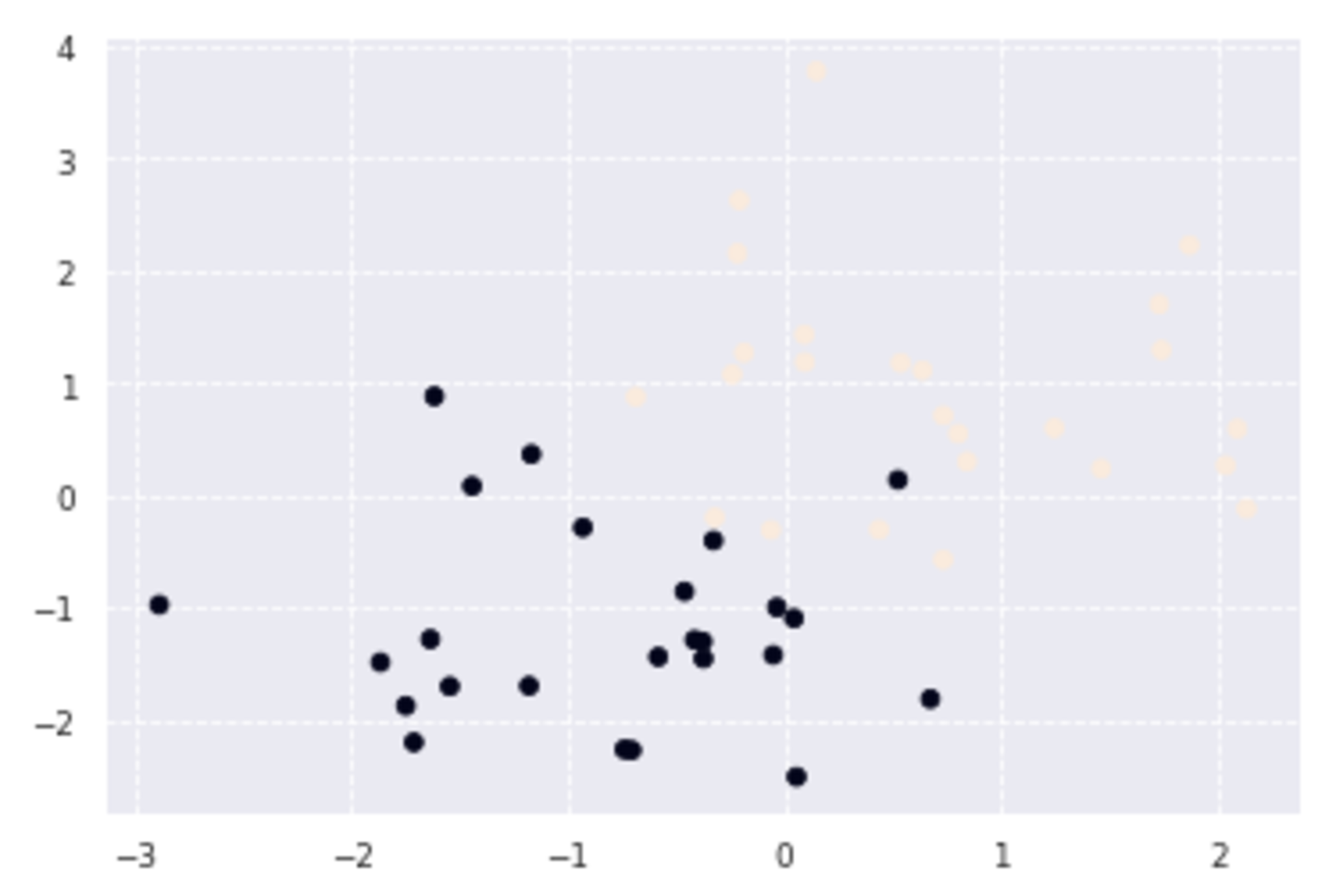
n_neighbors = 3
xx0, xx1 = np.meshgrid(np.linspace(-5, 5, 100), np.linspace(-5, 5, 100))
X_test = np.array([xx0, xx1]).reshape(2, -1).T
y_pred = knc_predict(n_neighbors, X_train, ys_train, X_test)
plt_resut(X_train, ys_train, y_pred)
最近傍のデータを3つ取ってきたケースで、今回の境界では誤って分類されたものが2つあることがわかる。
k-means
概要
k-meansは教師なし学習のひとつでクラスタリング手法である。
与えられたデータを$k$個のクラスタに分類することができる。k-meansのアルゴリズムの概要は下記の通りである。
- 各クラスタ中心の初期値を設定する。
- 各データ点に対して、各クラスタ中心との距離を計算し、最も距離が近いクラスタを割り当てる。
- 各クラスタの平均ベクトル(中心)を計算する。
- 収束するまで2, 3の処理を繰り返す。
k-meansは$k$の値や各クラスタ中心の初期値によってクラスタリング結果が変わることに注意する。
実装演習
必要なライブラリをインポートする。
      import numpy as np
import pandas as pd
import matplotlib.pyplot as plt
from sklearn import cluster, preprocessing, datasets

from sklearn.cluster import KMeans
wineデータセットを読み込み、Xに説明変数、yに目的変数を入力する。yは0か1か2の値を取る。
      wine = datasets.load_wine()

X = wine.data
y=wine.target

print(X.shape)
print(y.shape)
178件データがあり、説明変数は13個あることがわかる。
kmeansにより3つのクラスタに分けてみる。
      model = KMeans(n_clusters=3)
labels = model.fit_predict(X)
df = pd.DataFrame({'labels': labels})

def species_label(theta):
    if theta == 0:
        return wine.target_names[0]
    if theta == 1:
        return wine.target_names[1]
    if theta == 2:
        return wine.target_names[2]

df['species'] = [species_label(theta) for theta in wine.target]
pd.crosstab(df['labels'], df['species'])
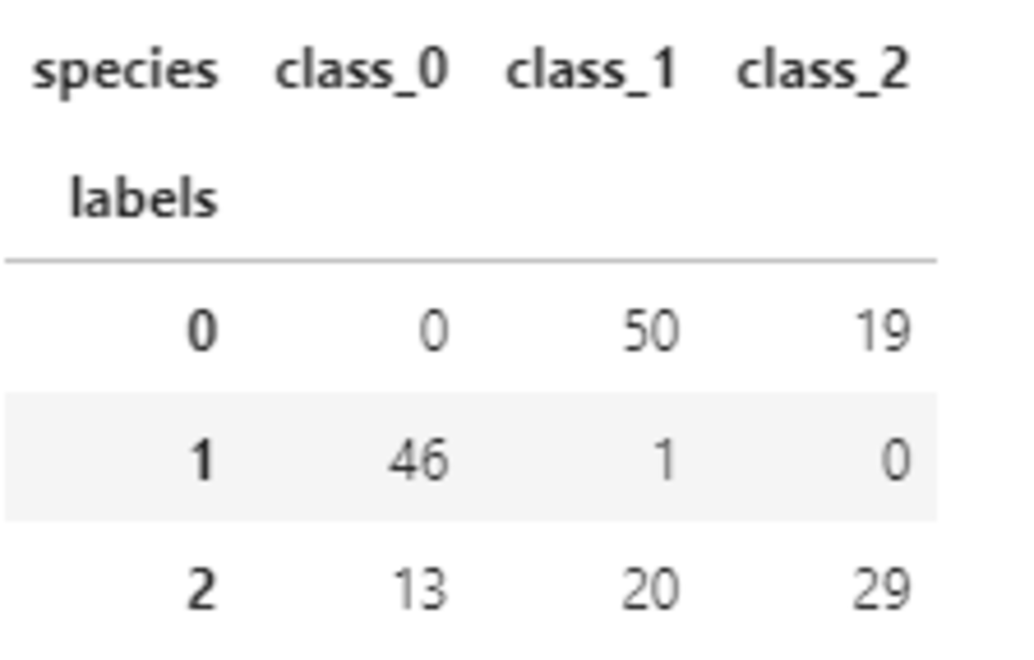
今回のデータでは、うまく分類ができていないように見受けられる。
サポートベクターマシン
概要
サポートベクターマシン(SVM)は教師あり学習のひとつで、線形二値分類器である。
SVMでの最適化はマージンを最大化することである。ここでマージンとは、決定境界(超平面)と決定境界に最も近い訓練データとの距離のことである。
決定境界に最も近い訓練データをサポートベクトルという。
訓練データを$(\boldsymbol{x}_i,y_i),\ i=1,\cdots,n$とする。ここで、任意の$i$に対して、$\boldsymbol{x}_i \in \mathbb{R}^{m}$、$y_i$は1か-1に値を取る。
データ$\boldsymbol{x} \in \mathbb{R}^{m}$に対して、決定境界を記述する式は下記の通り、2つのパラメータ$\boldsymbol{w} \in \mathbb{R}^{m}$、$b \in \mathbb{R}$によって与えらえる。
\begin{align}
\boldsymbol{w}^T\boldsymbol{x}+b
= 0
\end{align}
あるデータ$\boldsymbol{x} \in \mathbb{R}^{m}$に対して、予測されるラベルは下記のように与えられる。
\begin{align}
y
= \mathrm{sign}(\boldsymbol{w}^T\boldsymbol{x}+b)
\end{align}
SVMの目標は訓練データを利用してパラメータ$\boldsymbol{w}$と$b$の最適な値を見つけることである。
データ$\boldsymbol{x}_i$のマージンは点と直線の距離の公式から以下のように表現できる。
\begin{align}
\frac{y_i(\boldsymbol{w}^T\boldsymbol{x}_i+b)}{\|\boldsymbol{w}\|}
\end{align}
ここで、
\begin{align}
\|\boldsymbol{w}\|=\sqrt{\sum_{j=1}^{m}w_{j}^2}
\end{align}
$\boldsymbol{w}$と$b$を定数倍してもマージンの値は変わらないため、定数倍をしてサポートベクトルを通る直線を$y_i=1$では$\boldsymbol{w}^T\boldsymbol{x}+b=1$、$y_i=-1$では$\boldsymbol{w}^T\boldsymbol{x}+b=-1$となるような$\boldsymbol{w}$と$b$にする。
このときマージンの最大値は以下のように表現できる。
\begin{align}
\frac{1}{\|\boldsymbol{w}\|}
\end{align}
したがって、SVMのパラメータ推定問題は以下の最適化問題として定義できる。
\begin{align}
&\mathrm{min}\frac{1}{2}\|\boldsymbol{w}\|,\\
&\mathrm{subject\ to}\ y_i(\boldsymbol{w}^T\boldsymbol{x}_i+b) \geqq 1, \ i=1,\cdots,n
\end{align}
これはラグランジュの未定乗数法により、見通しのよい双対問題に変換することで解く。
ラグランジュ乗数ベクトル$\boldsymbol{a}=(a_1,\cdots,a_n)^T$を導入すると、上記最適化問題は以下を最小化する問題を解くことと同等である。
\begin{align} L(\boldsymbol{w},b,\boldsymbol{a})=\frac{1}{2}\|\boldsymbol{w}\|+\sum_{i=1}^{n}a_i(1-y_i(\boldsymbol{w}^T\boldsymbol{x}_i+b)) \end{align}
これが最小になるのは$\boldsymbol{w}$および$b$について偏微分したときの値が0になるときだから、それらを計算すると、以下が求まる。
\begin{align}
\boldsymbol{w}
&= \sum_{i=1}^{n}a_iy_i\boldsymbol{x}_i,\\
0
&= \sum_{i=1}^{n}a_iy_i
\end{align}
ここから最適化問題は結局以下を最大化する問題となる。
\begin{align} \mathrm{max}(\sum_{i=1}^{n}a_i-\frac{1}{2}\sum_{i=1}^{n}\sum_{j=1}^{n}a_ia_jy_iy_j\boldsymbol{x}_i^T\boldsymbol{x}_j),\\ \mathrm{subject\ to}\ a_i \geqq 0, \ i=1,\cdots,n,\ \sum_{i=1}^{n}a_iy_i=0 \end{align}
以上がSVMの基本的な考え方で、線形分離不可能な場合は以下の2つの対策がある。
ソフトマージン
境界を越えてしまうデータを許容する方法である。スラック変数$\xi$を導入し、ソフトマージンの場合の最適化すべき対象は以下のように表現される。パラメータ$C$によって誤分類のペナルティを制御する。
\begin{align}
& \mathrm{min}\frac{1}{2}\|\boldsymbol{w}\|+C\sum_{i=1}^{n}\xi_i,\\
& \mathrm{subject\ to}\ y_i(\boldsymbol{w}^T\boldsymbol{x}_i+b) \geqq 1-\xi_i, \ i=1,\cdots,n,\ \xi_i \ge 0
\end{align}
カーネルトリック
非線形な基底関数を使用して訓練データをより高次元の特徴量空間へ変換し、この新しい特徴量空間で線形のSVMモデルを学習する手法である。基底関数を$\phi$とすると、このケースの目的関数は以下のようになる。
\begin{align} & \mathrm{max}(\sum_{i=1}^{n}a_i-\frac{1}{2}\sum_{i=1}^{n}\sum_{j=1}^{n}a_ia_jy_iy_j\phi(\boldsymbol{x}_i)^T\phi(\boldsymbol{x}_j)) \end{align}
実装演習
ライブラリをインポートする。
      %matplotlib inline
import numpy as np
import matplotlib.pyplot as plt
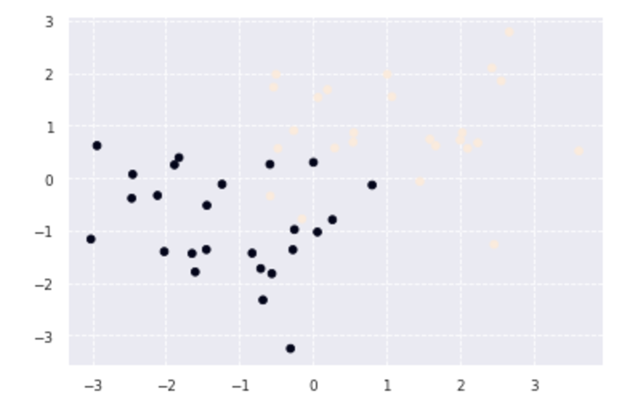
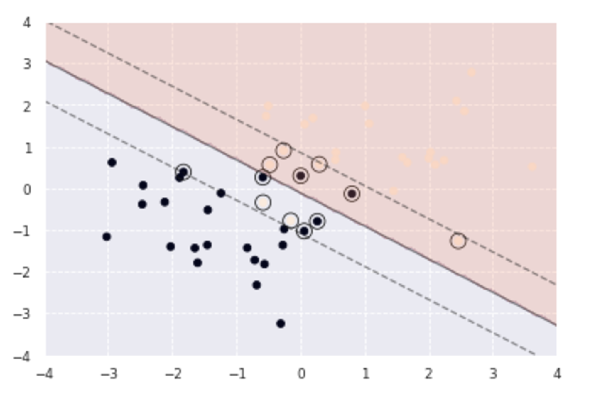
線形分離可能
- 訓練データ生成
      def gen_data():
    x0 = np.random.normal(size=50).reshape(-1, 2) - 2.
    x1 = np.random.normal(size=50).reshape(-1, 2) + 2.
    X_train = np.concatenate([x0, x1])
    ys_train = np.concatenate([np.zeros(25), np.ones(25)]).astype(np.int)
    return X_train, ys_train

X_train, ys_train = gen_data()
plt.scatter(X_train[:, 0], X_train[:, 1], c=ys_train)
上記により、図のようなデータが生成された。紫の点の集まりと黄色の点の集まりの間にすき間があるので、線形SVMにより、境界線を引きたい。
- 学習
      t = np.where(ys_train == 1.0, 1.0, -1.0)

n_samples = len(X_train)
# 線形カーネル
K = X_train.dot(X_train.T)

eta1 = 0.01
eta2 = 0.001
n_iter = 500

H = np.outer(t, t) * K

a = np.ones(n_samples)
for _ in range(n_iter):
    grad = 1 - H.dot(a)
    a += eta1 * grad
    a -= eta2 * a.dot(t) * t
    a = np.where(a > 0, a, 0)
- 予測
      index = a > 1e-6
support_vectors = X_train[index]
support_vector_t = t[index]
support_vector_a = a[index]

term2 = K[index][:, index].dot(support_vector_a * support_vector_t)
b = (support_vector_t - term2).mean()

xx0, xx1 = np.meshgrid(np.linspace(-5, 5, 100), np.linspace(-5, 5, 100))
xx = np.array([xx0, xx1]).reshape(2, -1).T

X_test = xx
y_project = np.ones(len(X_test)) * b
for i in range(len(X_test)):
    for a, sv_t, sv in zip(support_vector_a, support_vector_t, support_vectors):
        y_project[i] += a * sv_t * sv.dot(X_test[i])
y_pred = np.sign(y_project)

# 訓練データを可視化
plt.scatter(X_train[:, 0], X_train[:, 1], c=ys_train)
# サポートベクトルを可視化
plt.scatter(support_vectors[:, 0], support_vectors[:, 1],
                    s=100, facecolors='none', edgecolors='k')
# 領域を可視化
#plt.contourf(xx0, xx1, y_pred.reshape(100, 100), alpha=0.2, levels=np.linspace(0, 1, 3))
# マージンと決定境界を可視化
plt.contour(xx0, xx1, y_project.reshape(100, 100), colors='k',
                     levels=[-1, 0, 1], alpha=0.5, linestyles=['--', '-', '--'])


# マージンと決定境界を可視化
plt.quiver(0, 0, 0.1, 0.35, width=0.01, scale=1, color='pink')

境界線は上の図のようになる。なお、丸はサポートベクトルである。
線形分離不可能(カーネルトリック)
- 訓練データ生成
      factor = .2
n_samples = 50
linspace = np.linspace(0, 2 * np.pi, n_samples // 2 + 1)[:-1]
outer_circ_x = np.cos(linspace)
outer_circ_y = np.sin(linspace)
inner_circ_x = outer_circ_x * factor
inner_circ_y = outer_circ_y * factor

X = np.vstack((np.append(outer_circ_x, inner_circ_x),
               np.append(outer_circ_y, inner_circ_y))).T
y = np.hstack([np.zeros(n_samples // 2, dtype=np.intp),
               np.ones(n_samples // 2, dtype=np.intp)])
X += np.random.normal(scale=0.15, size=X.shape)
x_train = X
y_train = y

plt.scatter(x_train[:,0], x_train[:,1], c=y_train)

このような訓練データが生成されたが、単純には分離できないようにみうけられる。
- 学習
カーネルとしてRBFカーネルを利用し、新たな特徴量空間で線形分離することを考える。
      def rbf(u, v):
        sigma = 0.8
        return np.exp(-0.5 * ((u - v)**2).sum() / sigma**2)

X_train = x_train
t = np.where(y_train == 1.0, 1.0, -1.0)

n_samples = len(X_train)
# RBFカーネル
K = np.zeros((n_samples, n_samples))
for i in range(n_samples):
    for j in range(n_samples):
        K[i, j] = rbf(X_train[i], X_train[j])

eta1 = 0.01
eta2 = 0.001
n_iter = 5000

H = np.outer(t, t) * K

a = np.ones(n_samples)
for _ in range(n_iter):
    grad = 1 - H.dot(a)
    a += eta1 * grad
    a -= eta2 * a.dot(t) * t
    a = np.where(a > 0, a, 0)
- 予測
      index = a > 1e-6
support_vectors = X_train[index]
support_vector_t = t[index]
support_vector_a = a[index]

term2 = K[index][:, index].dot(support_vector_a * support_vector_t)
b = (support_vector_t - term2).mean()

xx0, xx1 = np.meshgrid(np.linspace(-1.5, 1.5, 100), np.linspace(-1.5, 1.5, 100))
xx = np.array([xx0, xx1]).reshape(2, -1).T

X_test = xx
y_project = np.ones(len(X_test)) * b
for i in range(len(X_test)):
    for a, sv_t, sv in zip(support_vector_a, support_vector_t, support_vectors):
        y_project[i] += a * sv_t * rbf(X_test[i], sv)
y_pred = np.sign(y_project)

# 訓練データを可視化
plt.scatter(x_train[:, 0], x_train[:, 1], c=y_train)
# サポートベクトルを可視化
plt.scatter(support_vectors[:, 0], support_vectors[:, 1],
                    s=100, facecolors='none', edgecolors='k')
# 領域を可視化
plt.contourf(xx0, xx1, y_pred.reshape(100, 100), alpha=0.2, levels=np.linspace(0, 1, 3))
# マージンと決定境界を可視化
plt.contour(xx0, xx1, y_project.reshape(100, 100), colors='k',
                     levels=[-1, 0, 1], alpha=0.5, linestyles=['--', '-', '--'])
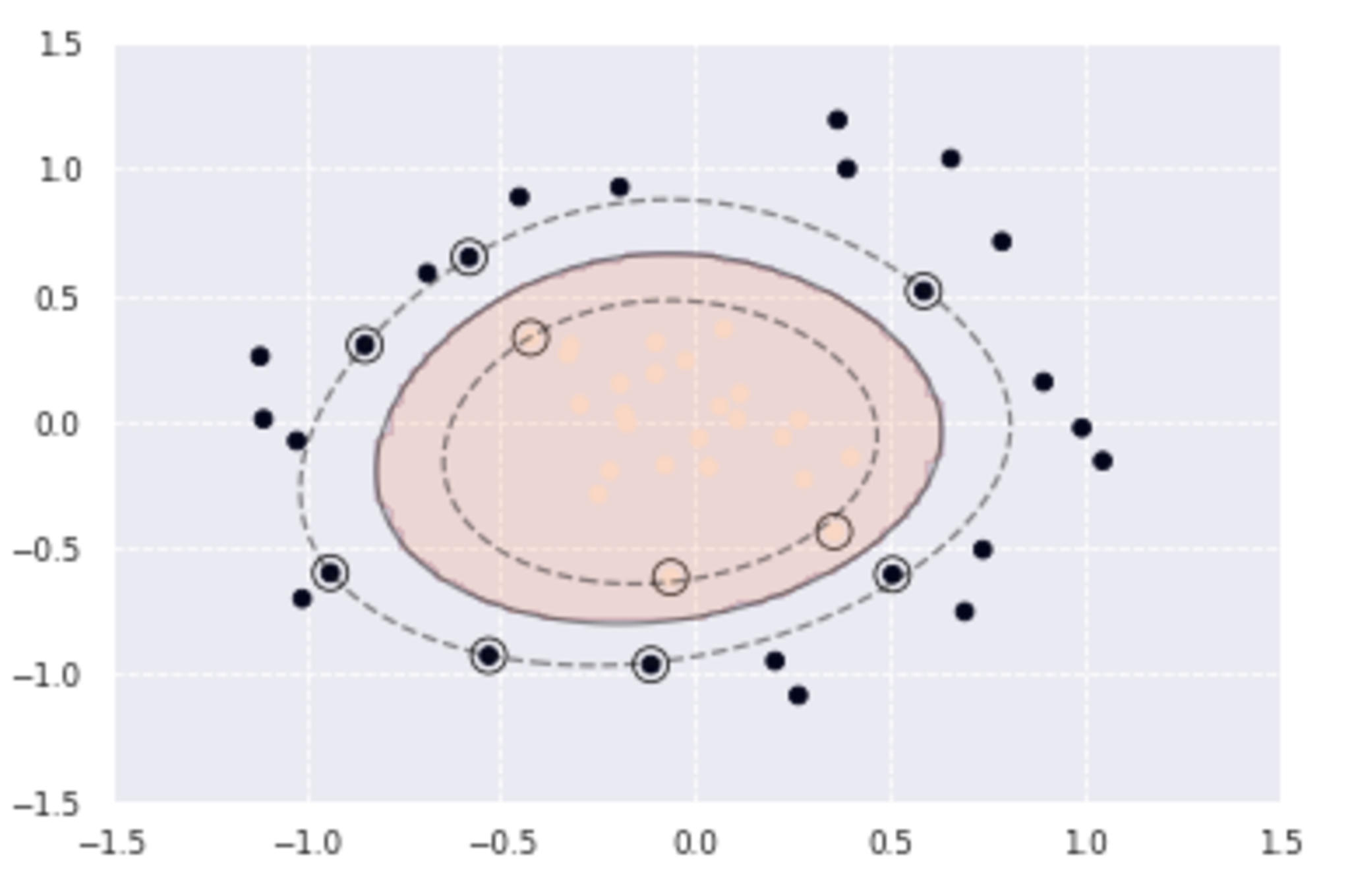
カーネルトリックにより、以下のように曲線によりデータを分類することができたことがわかる。
線形分離不可能(ソフトマージン)
- 訓練データ生成
      x0 = np.random.normal(size=50).reshape(-1, 2) - 1.
x1 = np.random.normal(size=50).reshape(-1, 2) + 1.
x_train = np.concatenate([x0, x1])
y_train = np.concatenate([np.zeros(25), np.ones(25)]).astype(np.int)

plt.scatter(x_train[:, 0], x_train[:, 1], c=y_train)
 a
a
データに重なりがあるため、誤差を許容するソフトマージンによって分離することを考える。
- 学習
      X_train = x_train
t = np.where(y_train == 1.0, 1.0, -1.0)

n_samples = len(X_train)
# 線形カーネル
K = X_train.dot(X_train.T)

C = 1
eta1 = 0.01
eta2 = 0.001
n_iter = 1000

H = np.outer(t, t) * K

a = np.ones(n_samples)
for _ in range(n_iter):
    grad = 1 - H.dot(a)
    a += eta1 * grad
    a -= eta2 * a.dot(t) * t
    a = np.clip(a, 0, C)
- 予測
      index = a > 1e-8
support_vectors = X_train[index]
support_vector_t = t[index]
support_vector_a = a[index]

term2 = K[index][:, index].dot(support_vector_a * support_vector_t)
b = (support_vector_t - term2).mean()

xx0, xx1 = np.meshgrid(np.linspace(-4, 4, 100), np.linspace(-4, 4, 100))
xx = np.array([xx0, xx1]).reshape(2, -1).T

X_test = xx
y_project = np.ones(len(X_test)) * b
for i in range(len(X_test)):
    for a, sv_t, sv in zip(support_vector_a, support_vector_t, support_vectors):
        y_project[i] += a * sv_t * sv.dot(X_test[i])
y_pred = np.sign(y_project)

# 訓練データを可視化
plt.scatter(x_train[:, 0], x_train[:, 1], c=y_train)
# サポートベクトルを可視化
plt.scatter(support_vectors[:, 0], support_vectors[:, 1],
                    s=100, facecolors='none', edgecolors='k')
# 領域を可視化
plt.contourf(xx0, xx1, y_pred.reshape(100, 100), alpha=0.2, levels=np.linspace(0, 1, 3))
# マージンと決定境界を可視化
plt.contour(xx0, xx1, y_project.reshape(100, 100), colors='k',
                     levels=[-1, 0, 1], alpha=0.5, linestyles=['--', '-', '--'])
境界線付近で一部分類に誤りがあるデータがあるが、直線での分類がおおよそできていることが確認できる。